Most people never notice good typography. They notice bad typography straight away. A cramped menu. A website you have to squint at. A flyer that uses five fonts and feels like a ransom note. Typography quietly shapes how your business is judged, and you do not need a design degree to get the basics right.
This guide covers the typography basics every business owner should know. Master these few ideas and your brand will instantly look more professional, more readable and more trustworthy.
What is typography?
Typography is the art of arranging type so it is easy to read and pleasant to look at. It covers your choice of fonts, the size of your text, the space between lines and how you organise words on a page. It applies to your website, your social posts, your signage and every document you send.
Typography is not just decoration. It is a core part of your brand. The right type makes you feel premium, friendly, bold or trustworthy before anyone reads a word. The wrong type undercuts all of that, no matter how good your message is.
Serif or sans serif?
Fonts fall into two main families, and knowing the difference is the first step.
Serif fonts have small feet or strokes on the ends of letters. They feel traditional, established and trustworthy. Think of law firms, newspapers and heritage brands.
Sans serif fonts have no feet. They feel modern, clean and simple. Most tech companies and contemporary brands use them, especially on screens.
Neither is better. The right choice depends on your brand personality. A boutique accountant might lean serif. A new fitness studio might lean sans serif. What matters is that your font matches the feeling you want to create.
The golden rule: use fewer fonts
The single biggest typography mistake is using too many fonts. It makes everything look chaotic and amateur. The fix is simple. Use two fonts. At most, three.
A common, reliable approach is one font for headings and one for body text. Pick a heading font with personality and a body font that is clean and easy to read. Use them consistently and your brand instantly looks more pulled together.
If you want variety, do not add more fonts. Instead, use different weights and sizes of the same font. A bold heading, a medium subheading and a regular paragraph give you plenty of contrast without the mess.
Build a clear hierarchy
Hierarchy is how you guide the reader's eye. It tells people what to read first, second and third. Without it, everything competes for attention and nothing stands out.
You create hierarchy with size, weight and space. Your most important message should be the largest and boldest. Supporting text should be smaller. This is not just about looks. It helps people scan and understand your message fast, which matters because most people skim before they read.
- Headings. Large and bold, to grab attention and break up content.
- Subheadings. Medium size, to organise sections and aid scanning.
- Body text. Comfortable to read at length, never cramped.
- Captions and labels. Smaller, for details that support the main point.
Make it easy to read
Readability is where typography either works or fails. Beautiful type that is hard to read has failed at its main job. A few simple habits make a big difference.
Keep your body text large enough. On the web, 16 pixels is a sensible minimum for body copy, and many sites go larger. Give your lines room to breathe with generous line spacing. Avoid very long lines, because the eye loses its place. And keep strong contrast between text and background, which also makes your content more accessible.
Accessibility is not optional, either. Around 2.2 billion people worldwide live with a vision impairment, according to the World Health Organization. Readable type with good contrast means more of your audience can actually use your content.
Common typography mistakes to avoid
A few small habits separate amateur design from professional design. Watch out for these.
- Too many fonts. Stick to two and your brand looks instantly cleaner.
- Text that is too small. If people have to squint, you lose them.
- Poor contrast. Light grey text on a white background is hard work to read.
- Cramped lines. Add spacing so words have room to breathe.
- Centring long paragraphs. Left-aligned body text is far easier to read.
Typography is part of your brand
Your fonts are as much a part of your identity as your logo and colours. Once you choose them, use them everywhere, the same way, every time. That consistency is what builds recognition and trust. It is also why typography sits at the heart of good branding.
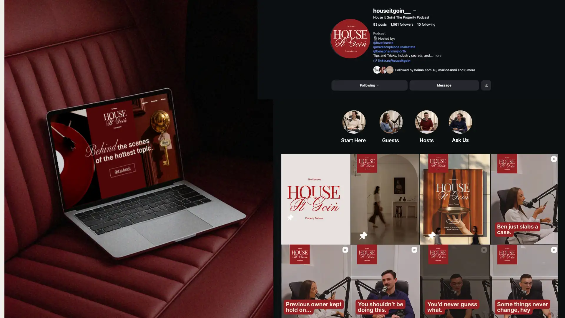
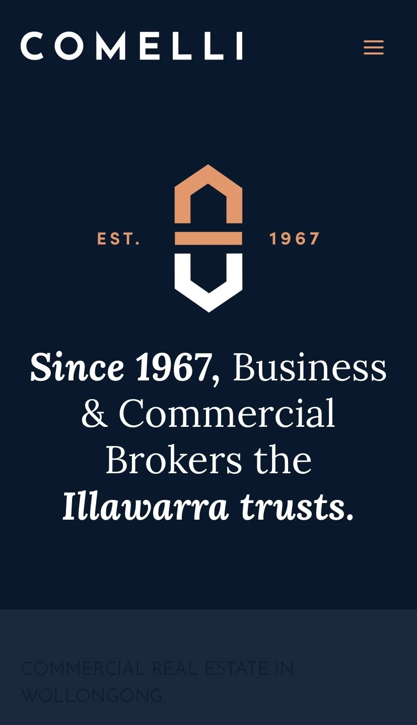
If you want your type handled by experts across your website, print and social, our graphic design service in Wollongong builds it into a brand system that stays consistent everywhere. To see why that consistency matters so much, read our guide on why consistent design builds customer trust. And since type and logos work hand in hand, our piece on great logo principles is a useful next read.
Get the basics right
You do not need to be a typographer to use type well. Pick two fonts that suit your brand. Build a clear hierarchy. Keep everything readable. Use your fonts consistently. Do those four things and your business will look more professional than competitors who never think about it.
If you would like help choosing fonts and building a brand that reads beautifully everywhere, we can help. Get in touch for a free, no-obligation chat.
Written by Sofia Cavalli, Creative Director at Adcraft Studio.


.webp)


.webp)


.webp)

.webp)