Written by Sofia Cavalli, Creative Director at Adcraft Studio.
A logo is the smallest part of your brand, yet it carries the heaviest load. It sits on your shopfront, your invoices, your website, your social posts, and the side of your van. People see it long before they read a word about you. In a few seconds it tells them whether you look organised, trustworthy, and worth their money. That is a big job for one small mark, and it is why the best logos are built on principles rather than guesswork.
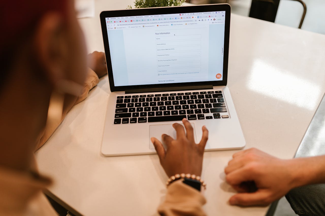
Plenty of business owners in Wollongong treat a logo as a quick job. They grab a cheap template, pick a font they like, and move on. The problem shows up later, when the logo looks blurry on a sign, clashes with the website, or feels nothing like the business it represents. A logo that follows a few clear principles avoids all of that. It works at any size, reads in any setting, and still feels right years later. Here is what those principles are, and why each one matters for your bottom line.
A logo is a signpost, not a painting
The first principle is the easiest to forget. A logo does not need to explain everything your business does. It needs to be recognised. Think of the brands you can picture with your eyes closed. None of them packed their whole story into the mark. They picked one simple idea and made you remember it. Your logo works the same way. Its job is to act as a fast, reliable signpost that says "this is us" wherever it appears.
When you treat a logo as a piece of art, you start adding detail to make it impressive. When you treat it as a signpost, you strip detail away so it is instantly clear. That shift in thinking sits behind almost every strong identity. A good logo design process starts with the question of what people need to recognise, not what looks clever on a screen.
Simple beats clever every time
Simplicity is the principle that does the most work. A simple logo is easier to recognise, easier to remember, and far easier to use. It scales down to a tiny app icon without turning to mush, and it scales up on a billboard without looking thin. Complicated logos fall apart at small sizes, and most of your customers will first meet your brand on a phone screen.
Simple does not mean boring or lazy. It takes real skill to reduce an idea to its cleanest form and still give it character. The trend across 2026 has moved hard towards this kind of intentional restraint, with designers removing anything that does not add meaning. Clean shapes, strong proportions, and a single clear idea now beat busy, decorated marks. For a local business that wants to look established, simplicity is the fastest way to read as professional rather than amateur.
It has to be memorable
You cannot control how often someone sees your logo, but you can control how easy it is to remember. Memorable logos usually share a few traits. They have a distinctive shape or angle. They use one idea well instead of three ideas poorly. And they have a small point of difference that sticks in the mind. The goal is for someone in Wollongong to see your mark once, then spot it again a week later and know exactly who you are.
Memory is tied to repetition and consistency, which is where logos start to pay for themselves. Research has found that presenting a brand consistently across every platform can lift revenue by up to 23 percent. A clear, memorable logo is the anchor that makes that consistency possible, because the same mark shows up the same way everywhere and quietly builds recognition each time.
It must work everywhere
A logo lives in dozens of places, and it has to hold up in all of them. That means it needs to work in full colour, in plain black, and in white on a dark background. It needs to be clear on a business card and on a shopfront sign. A logo that only looks good in one specific setting is a logo that will let you down the moment you print it, stitch it, or shrink it.
This is why good designers build a logo as a small kit rather than a single image. You get a main version, a stacked version, an icon on its own, and the right colour formats for print and screen. One newer test for 2026 is motion. Animated and kinetic logos are growing fast as more brands show up in video, reels, and on-screen ads. A logo built on simple shapes animates cleanly, while a cluttered one becomes a mess the moment it moves. Designing for flexibility now saves you money later, because you are not paying to redraw the mark every time a new format appears.
Timeless beats trendy
Trends are tempting because they look current, but they age fast. A logo that chases this year's style will look dated in three or four years, and rebuilding a brand identity is expensive and disruptive. The principle here is to aim for something that still looks right a decade from now. You can always refresh colours or refine details, but the core mark should be steady.
This does not mean ignoring what is happening in design. It means using trends with care. The human, hand-drawn, and natural styles popular in 2026 can give a logo warmth and personality, but they work best when they suit the business rather than chase a fashion. A bakery or a wellness studio in the Illawarra might lean into a warmer, crafted feel, while an accountant leans cleaner. The test is simple. Will this still feel like you when the trend has passed? If yes, it is safe to use.
It has to fit the brand
A great logo is not just well made, it is right for the specific business behind it. A law firm and a surf brand should not feel the same, even if both logos are clean and simple. The shapes, the colours, and the type all send signals about who you are and who you serve. Getting this fit right is what separates a logo that merely looks nice from one that actually helps you sell.
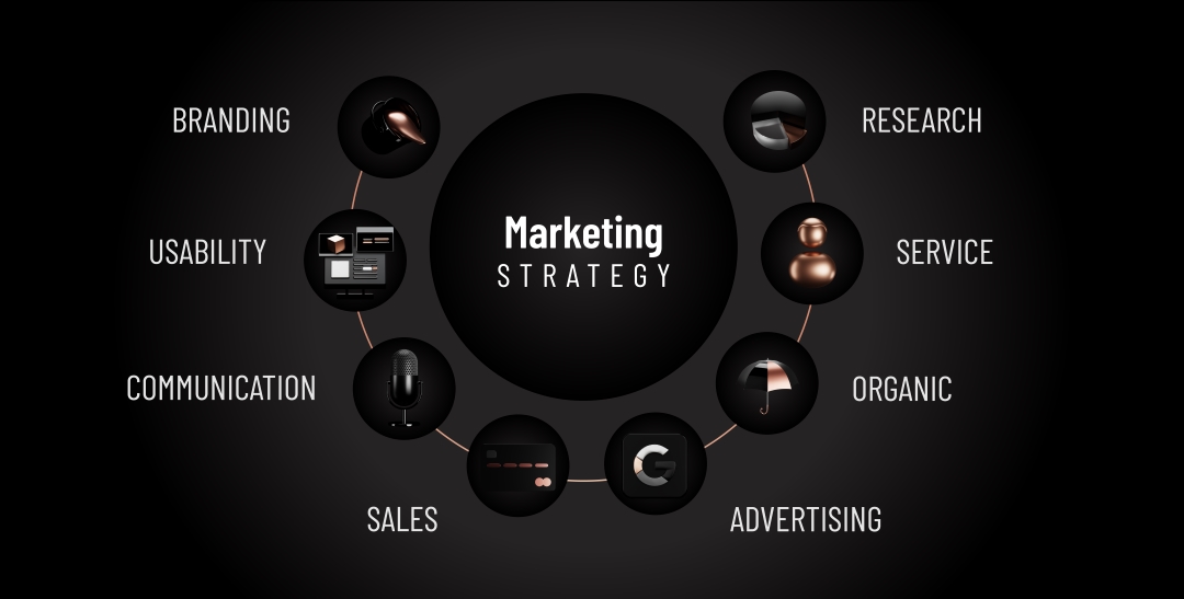
This is why a logo should never be designed in isolation. It needs to sit inside a wider sense of the brand, including how you sound, what you stand for, and who you want to attract. At Adcraft we treat the mark as one part of a complete identity, which you can see across our branding work and the projects in our portfolio. When the logo matches the rest of the brand, every touchpoint reinforces the same message, and customers start to trust you faster.
Colour and type carry the meaning
Two parts of a logo quietly do a lot of the emotional work: colour and type. Colour sets the mood before anyone reads a thing. Calm blues, energetic reds, and natural greens all pull different feelings, and choosing the wrong palette can send the wrong message about your business. The shift towards natural, grounded colour palettes in 2026 reflects how many brands now want to feel honest and approachable rather than loud.
Type does the same job with letters. Custom and carefully chosen typography is one of the strongest ways to make a logo feel made for you rather than pulled from a free font pack. The letterforms you pick say whether you are modern or traditional, premium or friendly, serious or relaxed. Strong colour and type choices also feed straight into your other materials, from your signage to your graphic design and your website, so the whole brand holds together.
A logo is the start, not the finish
The final principle is one many business owners miss. A logo on its own does not build a brand. It is the anchor that everything else hangs from. Once the mark is right, it needs to be applied consistently across your website, your social media, your packaging, and your ads. That consistency is what turns a nice logo into real recognition and, over time, into revenue.
This is also where your logo connects to the rest of your marketing. A clean mark needs a clear website to live on, and a strong identity makes your ads and content work harder. If you want help getting the foundation right, our logo design team builds marks designed to last and to scale with you. The earlier you set this up properly, the less you spend fixing it down the track.
How much does a professional logo cost in Wollongong?
It depends on the depth of work involved. A simple logo on its own sits at the lower end, while a full identity with colour systems, type, and brand guidelines costs more because it does far more. The right way to think about it is value rather than price. A logo you use for the next ten years across every part of your business is a small cost spread over a long time. The best move is to get a clear quote based on what your business actually needs.
How long does it take to design a logo?
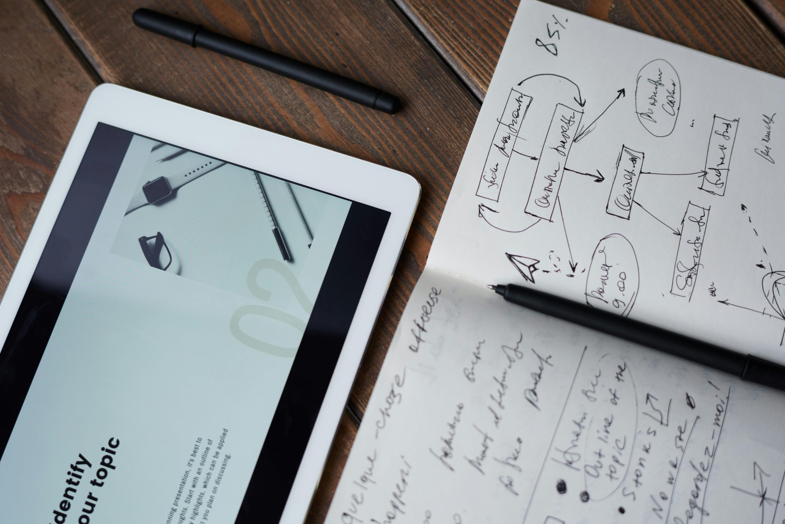
A considered logo usually takes a few weeks rather than a few days. Good design includes research, several rounds of concepts, and refinement based on your feedback. Rushing the process is how businesses end up with a mark they quietly dislike. A few weeks of proper work gives you something you are happy to use for years, which is well worth the wait.
Can I just use a free logo maker?
You can, but you often get what you pay for. Free makers pull from the same templates and fonts that thousands of other businesses use, so your logo ends up looking generic and easy to forget. They also tend to give you a single low-quality image rather than the full set of files you need for print, signage, and screen. For a business you plan to grow, a custom logo built on these principles is a far safer investment.
Written by Sofia Cavalli, Creative Director at Adcraft Studio, a marketing agency in Wollongong.

.webp)

.webp)


.webp)
.webp)