.webp)
Written by Aman Hirani, Web Developer and Data Scientist at Adcraft Studio.
Your product page is where the sale happens. Everything else in your store leads to it. Ads, search results, and homepage links all push people toward this one page, and this is where they decide to buy or leave. Yet most product pages are an afterthought. They have a photo, a price, and a buy button, and that is about it. That is exactly why so many stores leak sales every single day.
The good news is that small changes to a product page can lift sales fast, often without spending a cent more on traffic. A clearer photo, a better description, or a visible review can be the nudge that turns a browser into a buyer. This guide walks through the practical changes that make the biggest difference. If you sell online in Wollongong or across the Illawarra, these are the levers worth pulling first.
Why the Product Page Is Where Sales Are Won or Lost
A shopper on a product page is close to buying. They are interested. They just need a reason to feel confident, and a clear path to checkout. If the page answers their questions and removes their doubts, they buy. If it leaves them guessing, they hesitate, and a hesitating shopper usually leaves.
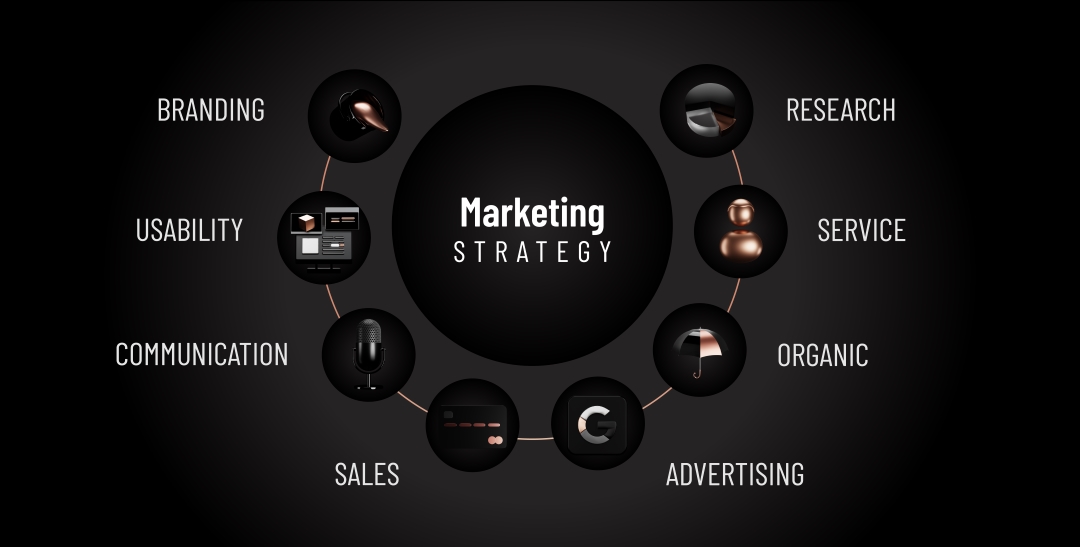
This is why product page optimisation gives such a strong return. You are not paying for more visitors. You are getting more out of the visitors you already have. Lift your conversion rate from one percent to two percent and you have doubled sales with the same traffic. That is the heart of good ecommerce web design in Wollongong, making each visit work harder.
Use Photos That Sell
Online, people cannot touch or hold your product. Photos do that job for you. This makes images the single most important part of a product page. Blurry, dark, or sparse photos kill trust instantly. Clear, bright, detailed images do the opposite. They let a shopper feel like they know exactly what they are getting.
Show the product from several angles. Include a close up of important details and an image that shows scale or the product in use. If it comes in different colours, show each one. High quality photos reduce uncertainty, and certainty is what drives the click to buy. This is one reason we treat professional imagery as part of the build, not an extra. It also pairs well with strong overall web design that frames each product properly.
Write Descriptions That Answer Questions
A good product description does more than list features. It answers the questions running through a shopper's mind. What is it made of? Will it fit? How does it work? What problem does it solve for me? Cover these and you remove the doubts that stop a sale.
Keep the writing clear and easy to scan. Use short paragraphs and bullet points for key facts like size, materials, and care. Lead with the benefit, then back it up with the detail. Avoid filler and hype. Honest, specific copy builds trust, and trust is what gets people to buy. Well written descriptions also help your products show up in search, which supports your wider SEO strategy and brings in more qualified shoppers.
Add Trust Signals That Reduce Risk
Buying online means taking a small risk. Will the product be good? What if it does not fit? What if something goes wrong? Trust signals answer these fears before they stop a sale. The most powerful one is reviews. Around nine in ten shoppers read reviews before buying, and seeing real feedback from other customers gives people confidence to commit.
Show star ratings and written reviews right on the product page. Display clear return and refund information so people know they are not stuck if it is wrong. Add trust badges for secure payment and show your shipping details honestly. Each of these removes a reason to hesitate. We dig deeper into hesitation at checkout in our guide on how to reduce cart abandonment, which picks up where the product page leaves off.
Make the Buy Button Impossible to Miss
It sounds obvious, but the buy button is often too small, too plain, or buried below other content. The call to action should stand out clearly from the rest of the page. Use a colour that contrasts, give it room to breathe, and place it where the eye lands, near the price and the main image.
Keep the wording simple and direct. Add to cart or Buy now works fine. Make sure the button is easy to tap on a phone, because most shoppers are on mobile. If a customer has to hunt for the way to buy, some will give up. The path from wanting the product to owning it should feel effortless. Reducing this kind of friction is a core part of conversion-focused design.
Show Price, Shipping, and Stock Clearly
Hidden costs are one of the biggest reasons people abandon a purchase. Surprise shipping fees at checkout feel like a trick, and shoppers leave. Avoid this by being upfront. Show the price clearly, and give shipping cost and delivery time on the product page itself wherever you can.
Stock and delivery details also help. Telling someone an item is in stock and will arrive in a few days creates confidence and a gentle sense of urgency. If something is low in stock, saying so honestly can encourage a quicker decision. The goal is no nasty surprises. When the full picture is clear early, more people follow through to checkout.
Keep the Page Fast on Mobile
Most ecommerce traffic is on mobile, and a slow product page loses buyers before they even see the product. Speed is tied straight to sales. A one second delay in load time can cut conversions by around seven percent, based on research on website speed. Big, uncompressed images are the usual culprit on product pages.
The fix is to compress images so they look sharp without being huge files, and to keep the page code lean. Test the page on a real phone over mobile data, not just on fast office wifi. A fast product page feels effortless and keeps people moving toward checkout. We cover the technical side in our guide on website speed and SEO, since speed helps you sell and helps you get found.
Test, Measure, and Keep Improving
A great product page is rarely built in one go. The best stores treat their pages as something to improve over time. Watch how shoppers behave. See where they drop off. Test one change at a time, like a new main photo or a clearer button, and keep what works.
This habit of small, steady improvements adds up to big gains over a year. Maybe a better description lifts sales on one product. Maybe moving reviews higher helps another. You only know by testing and measuring. Data shows you the real friction points rather than the ones you assume. This mindset is what turns a decent store into a high performing one, and it is something any Wollongong business can build into how it works.
Turning Product Pages Into Your Best Salespeople
Strong product pages do the selling for you, day and night. They answer questions, build trust, and make buying easy, so you capture more of the demand you already have. None of the changes here are complicated. Better photos, clearer copy, visible reviews, honest pricing, and fast loading. Together they can lift sales without a bigger ad budget.
If your store is getting visitors but not enough sales, your product pages are the first place to look. Small fixes here often deliver the fastest return in all of ecommerce. If you want help turning your product pages into real sales engines, our team can review your store and show you where the easy wins are. You can get in touch for a chat about your goals.
What makes a product page convert better?
Clear photos, a description that answers real questions, visible reviews, honest pricing and shipping, and a buy button that is easy to find. Speed matters too, especially on mobile. Each element removes a reason to hesitate. When a shopper feels informed and confident, and the path to buy is simple, more of them follow through to purchase.
How important are reviews on a product page?
Very important. Most shoppers read reviews before buying, and seeing real feedback from other customers builds the confidence to commit. Reviews act as proof that the product delivers and that you are trustworthy. Displaying star ratings and written reviews directly on the product page is one of the simplest ways to lift conversions.
Why are my product pages getting traffic but not sales?
Usually it is a trust or clarity problem. Shoppers may have unanswered questions, see unclear pricing, hit a slow page, or struggle to find the buy button. Surprise shipping costs at checkout are another common culprit. Review each page through the eyes of a first time visitor, fix the friction points, and test changes to see what lifts sales.
Written by Aman Hirani, Web Developer and Data Scientist at Adcraft Studio, a marketing agency in Wollongong helping local businesses turn their websites into real revenue.


.webp)


.webp)

.webp)