Written by Sofia Cavalli, Creative Director at Adcraft Studio.
A logo is the first thing most people learn about your business. It sits on your shopfront, your invoices, your van and your social posts. It works for you every single day, often before a single word is read. So the question is not just whether your logo looks nice today. The real question is whether it will still work for you in ten years. A logo that lasts saves you money, builds trust and keeps your brand looking sharp while your competitors keep starting over.
At Adcraft we design logos for businesses across Wollongong and the wider Illawarra. We have seen what happens when a logo is built on a passing fad, and we have seen what happens when it is built on a clear idea. This guide breaks down what actually makes a logo last. It covers the thinking, the craft and the new tools that are reshaping logo design in 2026, so you can make a smart choice for your own brand.
What a lasting logo really does for your business
A lasting logo is not about awards. It is about recognition. Every time someone sees your mark and remembers who you are, your marketing gets cheaper and your sales get easier. People buy from brands they recognise and trust. A logo that stays consistent over years builds that trust quietly in the background.
The money side is real too. One widely cited study found that presenting a brand consistently can lift revenue by up to 33 percent, because customers feel safer buying from a business that looks the same everywhere they meet it (PR Newswire). Your logo is the anchor of that consistency. If it keeps changing, or if it was never strong to begin with, you lose that compounding value. A good logo is an asset that grows more valuable the longer you keep it.
Start with the strategy, not the sketch
Most weak logos fail because the design started too early. Someone opened a tool, picked an icon and called it done. A logo that lasts starts with questions, not pictures. Who is this for? What does the business stand for? How should it feel different from the shop next door? When you answer these first, the design has something solid to stand on.
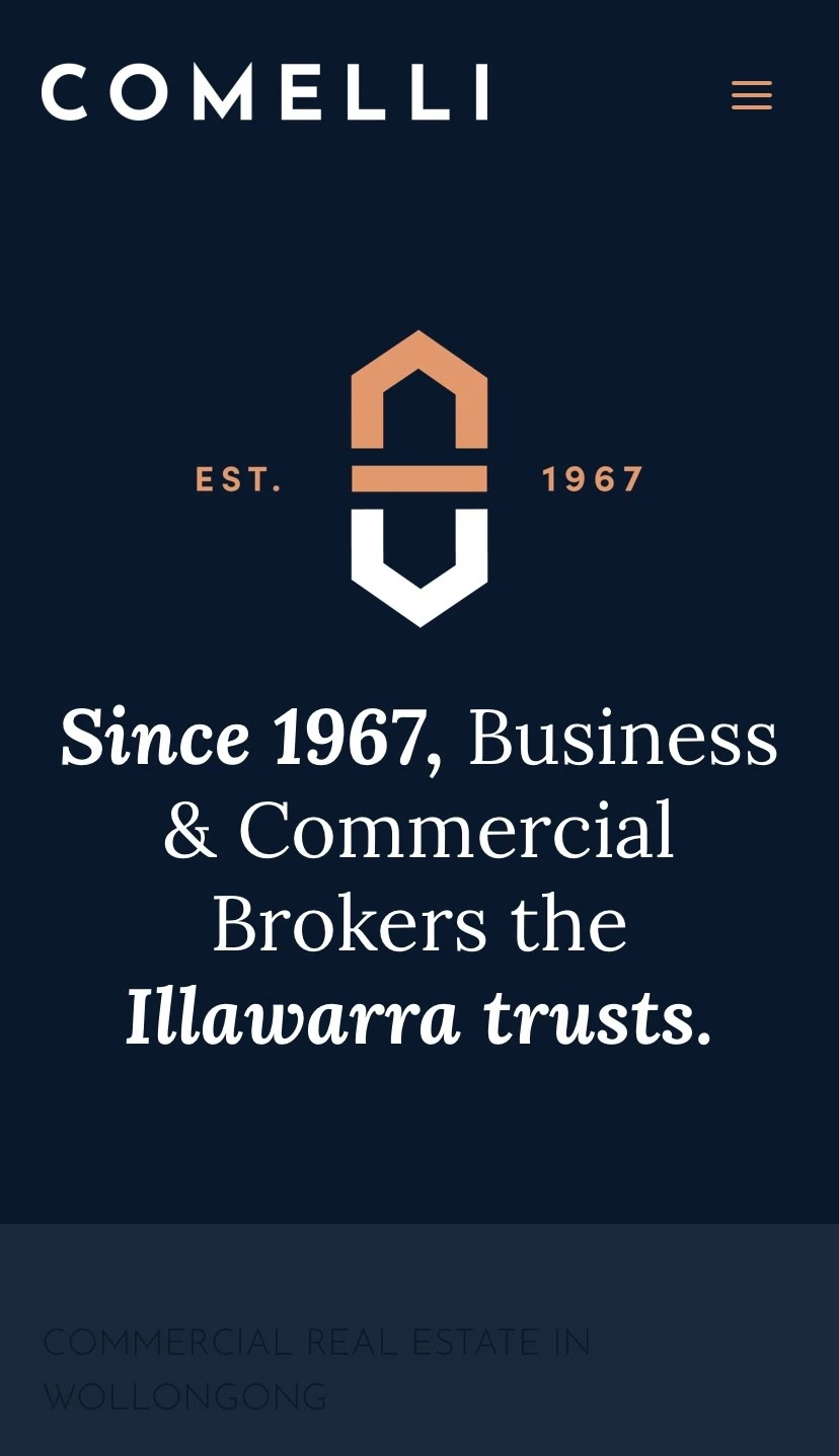
Strategy is where a good design partner earns their fee. We look at your customers, your market and your goals before we draw anything. A cafe in Thirroul, a builder in Dapto and a law firm in the Wollongong CBD all need different feelings from their mark. The shapes, the weight and the tone all flow from that early thinking. This is the same approach we bring to every logo design project in Wollongong, and it is the reason those logos keep working for years.
Simple shapes win over time
Think of the logos you can draw from memory. They are almost always simple. A simple mark is easier to recognise, easier to remember and easier to use at any size. It reads clearly on a tiny phone icon and on a large sign above your door. Busy logos with fine detail, heavy gradients and clever tricks tend to date fast and break down when they shrink.
Simple does not mean boring. It means every part of the logo earns its place. We remove anything that does not help the mark do its job. A clean shape also gives you room to grow. You can add patterns, photography and motion around a simple core without the whole identity falling apart. That flexibility is part of what makes a brand feel modern in 2026 while still feeling like itself.
Choose colours and type that age well
Colour and type carry a lot of feeling. They also carry a lot of risk if you chase whatever is popular this season. A colour that feels fresh today can look tired in three years. The trick is to pick a palette and a typeface that suit your business first and the trend second. Your colours should reflect your personality and work across print, screen and signage without losing their punch.
Type matters just as much. A logo wordmark needs to be readable at a glance and still feel right beside your other materials. We test type at large and small sizes, in colour and in plain black, before we settle. The goal is a system you can use with confidence for years. If your colours and fonts feel scattered, a wider look at your brand identity often fixes the root problem rather than just the logo.
Design for every screen, size and surface
Your logo lives in more places than ever. It shows up as a social profile picture, a website header, an app icon, an email sign-off and a printed flyer. A logo that lasts is built for all of these from the start. That usually means a primary version, a stacked version and a small icon or monogram that still reads when it is tiny.
One of the clearest shifts in 2026 is motion. Logos are no longer fixed pictures. Brands now use animated and adaptive marks that move on websites, social video and screens, and this trend has become a normal part of how logos are built rather than a nice extra (Envato). For a local business this matters because short video and animated content now win attention on the platforms your customers scroll every day. A logo designed with movement in mind helps your brand stand out in a feed, which keeps people watching and turns more views into real enquiries and revenue. We build flexible logo systems so your mark is ready for video, web and print without extra rework.
How AI is changing logo design in 2026
You cannot talk about logos in 2026 without talking about AI. Instant logo generators are everywhere, and they are tempting because they are cheap and fast. They are useful for rough ideas. The problem is sameness. When thousands of businesses pull from the same models, their logos start to look alike, and a logo that looks like everyone else cannot help you stand out or charge a premium.
The smarter view is to treat AI as a tool, not a designer. The strongest studios use AI to explore options and speed up production, then rely on human judgement to choose what actually means something for the brand (The Branding Journal). Machines can make endless variations. Only a person can decide which one tells your story and will still feel right in a decade. That mix of speed and meaning is exactly how we work. The result is a logo that feels custom to your business, not pulled from a template, and that difference shows up in how much customers trust and remember you.
Working with a logo designer in Wollongong
A logo rarely lives alone. It needs to sit beside your website, your signage, your social content and your printed materials. When all of these are designed together, the whole brand feels stronger and more trustworthy. That is why we pair logo work with wider graphic design in Wollongong and with web design, so every touchpoint matches.
If you are weighing up a fresh logo, look for a partner who asks about your business before showing you art, who designs for every size and screen, and who can show you real work. You can see examples of our logo and brand projects in our portfolio. When you are ready to start, our team is happy to talk it through. A well designed logo is one of the best value investments a local business can make, and getting it right early saves you from costly rebrands later. Reach out through our contact page and we can map out a plan for your Wollongong logo design.
Frequently asked questions
How much does a professional logo cost in Wollongong?
It depends on scope. A standalone logo costs less than a full brand identity with colours, type, guidelines and supporting assets. The key is value, not just price. A cheap logo that you replace in two years costs more in the long run than a strong one that lasts. We are happy to give you a clear quote once we understand your business and goals.
How long does it take to design a logo?
Most logo projects take two to four weeks. That allows time for the strategy, a few rounds of design and proper testing at different sizes. Rushing the process is how brands end up with a mark they regret. A short, focused timeline with clear feedback usually gives the best result.
Should I use an AI logo generator instead of a designer?
An AI generator is fine for a quick placeholder or a rough idea. For a logo that has to build trust and last for years, a designer is the safer choice. The risk with generators is that your logo looks like many others and says little about your business. A designer brings strategy and judgement that software still cannot match.
Sofia Cavalli is Creative Director at Adcraft, a marketing agency in Wollongong. See her profile here.

.webp)

.webp)

.webp)
.webp)