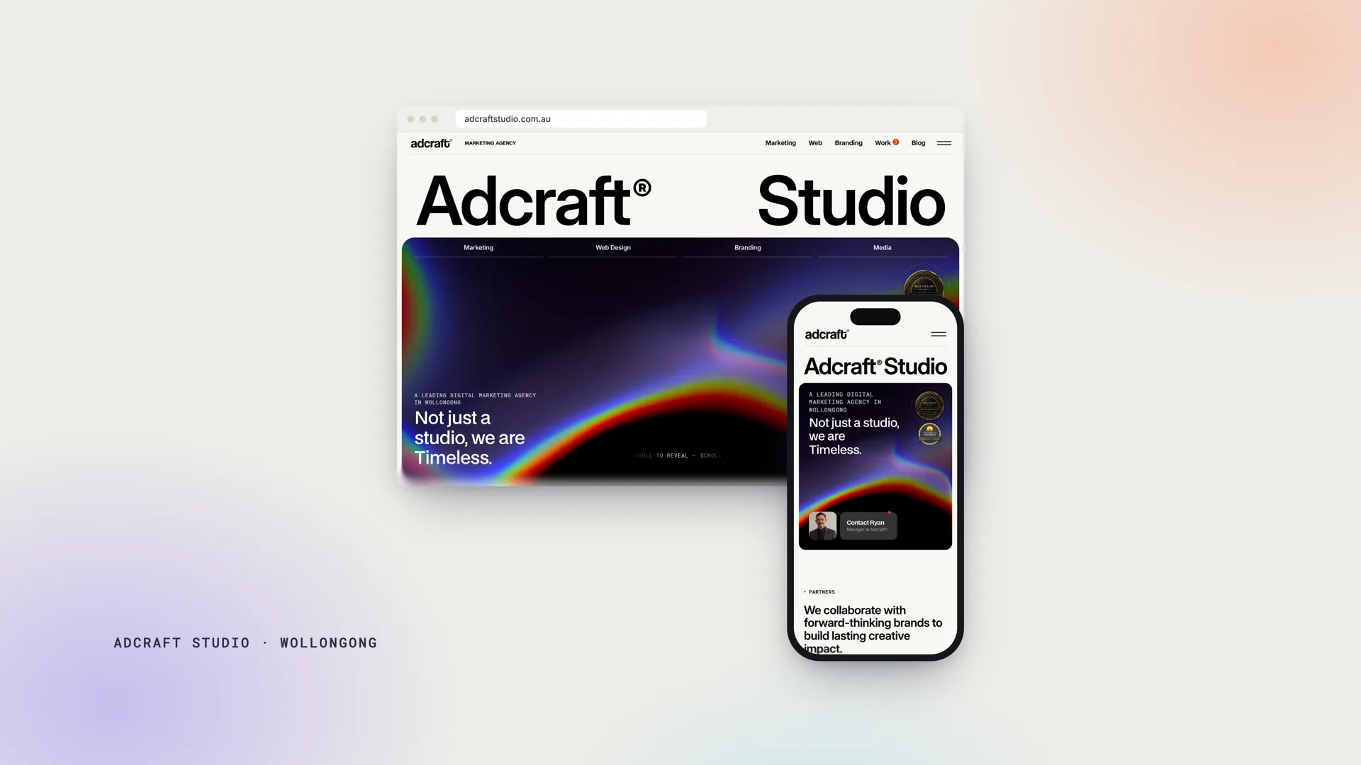
Strategy, art direction, UX and development.
The Dandy Loans website, which my team and I designed, achieved a Google Lighthouse score of 100 for Performance, 91 for Accessibility, 100 for Best Practices and 92 for SEO.
These results offer a useful point of departure because they make the technical quality of the project measurable.
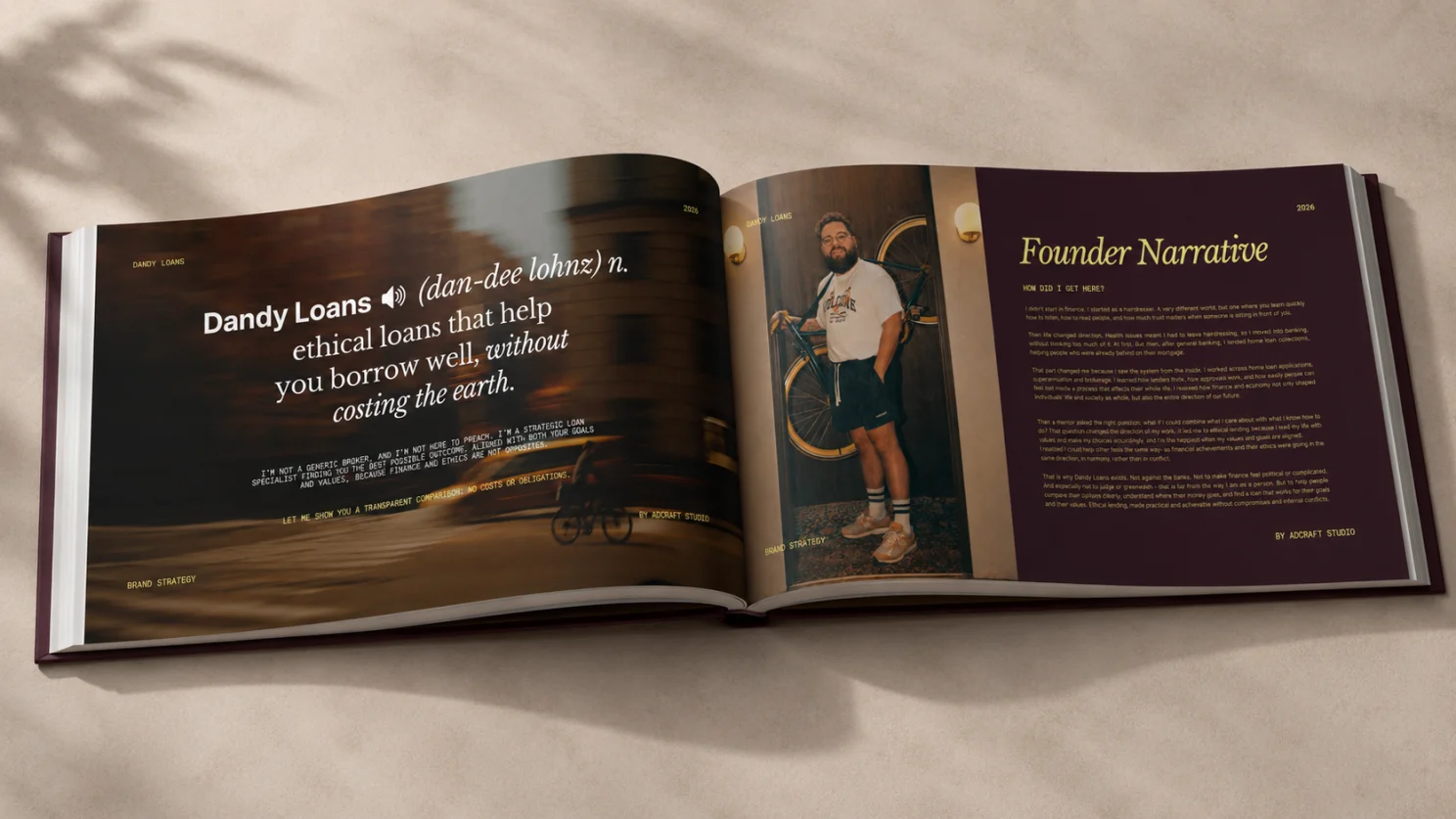
They demonstrate that an expressive, image-led and editorially art-directed website can also be fast, accessible, structurally rigorous and prepared for search.
The figures acquire their full significance, however, when considered as the outcome of a broader design process.
Website performance begins before development reaches the optimisation stage. It begins with the interpretation of the business, the definition of its position, the architecture of its information and the decisions made about what the user should encounter, understand and do.
Through my work at Adcraft Studio, I led the strategy, branding, UX, copy direction and website design for Dandy Loans. The project confirmed a principle that has become fundamental to my practice: a high-performing website emerges when commercial strategy, visual language, user experience and technical architecture are conceived as parts of the same system.
Technical speed cannot compensate for an indistinct proposition. Visual distinction cannot compensate for a disordered hierarchy. Refined typography cannot compensate for an uncertain conversion pathway. Each discipline acquires value through its relationship with the others.
The Dandy Loans project required this kind of integration because the business possessed a meaningful point of difference whose commercial expression demanded careful judgment.
Dandy Loans operates in financial services while introducing ethical considerations into the lending decision. The website, therefore needed to communicate a specialised position while preserving the gravity and competence expected of a financial adviser.
People tend to approach finance conservatively. Borrowing decisions involve capacity, repayments, lenders, long-term obligations and personal risk. The emotional atmosphere of the category is shaped by caution, uncertainty and a desire for reliable guidance.
At the same time, Dandy Loans needed a recognisable position within a market where many businesses share similar language, imagery and visual conventions. The brand had to speak to people who care about the wider consequences of their financial choices while remaining credible to those primarily concerned with the commercial viability of a loan.
This tension became the foundation of the project.
Positioning precedes visual design
The initial description of Dandy Loans as an ethical lending specialist was accurate, although commercially incomplete.
Presented in isolation, ethical lending could have appeared relevant only to people who had already adopted a firm values-led position. It could also have implied that ethical considerations might take precedence over a prudent financial outcome.
The more effective proposition centred on transparent comparison.
Dandy Loans helps clients compare traditional and ethical lending options, understand what is financially viable and make a better-informed decision. This interpretation preserved the distinctive purpose of the business while widening its commercial accessibility.
The service became useful before it became ideological.
A prospective client did not need to arrive with a settled conviction. Curiosity was sufficient. The invitation was to examine the available options and determine whether a suitable financial outcome could also accord with personal values.
This adjustment influenced every subsequent decision.
The copy adopted a consultative register. The calls to action invited comparison rather than commitment. The visual identity needed to convey authority without institutional coldness, while the user journey needed to reduce apprehension without trivialising the seriousness of the financial decision.
Positioning, in this sense, became the first act of interface design.
A website can only guide attention coherently once the central proposition has been resolved. Layout and typography acquire strategic force when they embody a clear idea; without that foundation, they remain matters of style.
Every business enters the market with a constellation of perceptions attached to it. A company may appear established but remote, innovative but untested, specialised but inaccessible, or capable but indistinguishable from its competitors.
Effective website strategy identifies the perception that requires reinforcement, correction or creation.
For Dandy Loans, the appropriate perception was one of calm authority.
The business needed to feel informed, mature and commercially serious, while retaining enough humanity to avoid the impersonal character of a large financial institution.
Defining the brand through a single idea
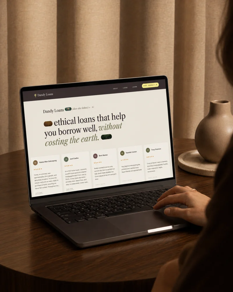
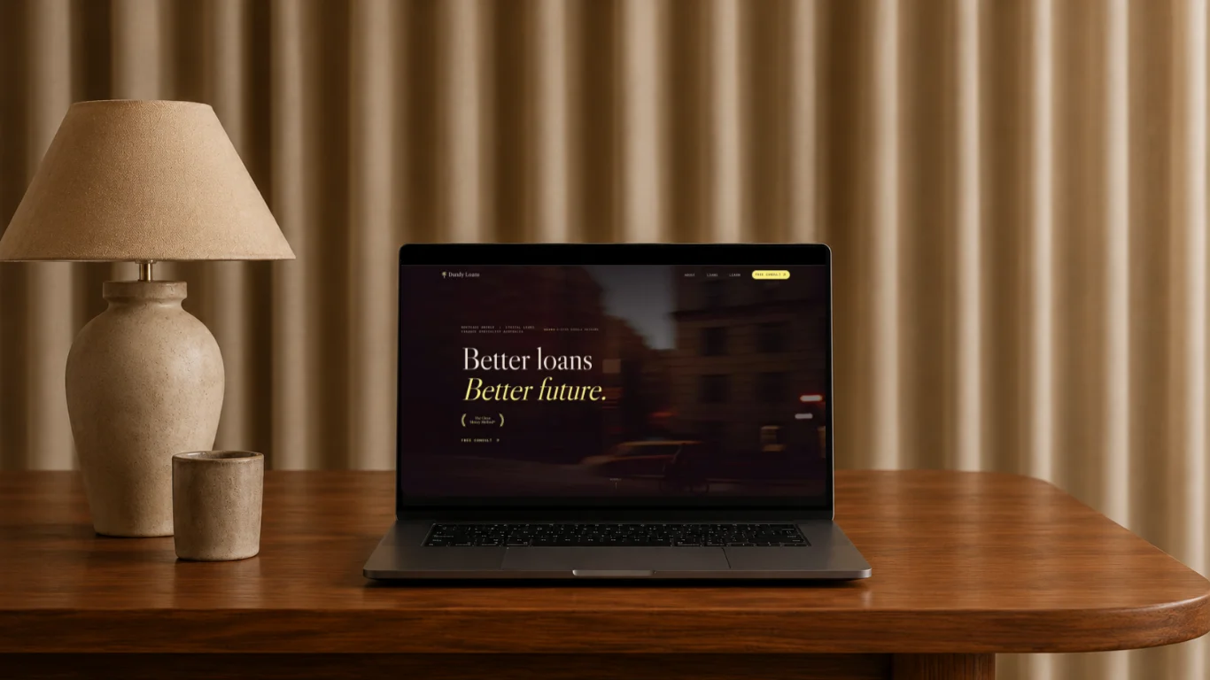
The opening screen in the About Page established this position through a dictionary-style definition:
“Ethical loans that help you borrow well, without costing the earth.”
The device performs several functions within a compact visual form. It gives immediate meaning to the name, defines the category, introduces the proposition and establishes an editorial tone.
It also creates a mnemonic structure.
Many websites begin with language that is technically unobjectionable but semantically interchangeable. Expressions such as “trusted solutions”, “tailored service” and “industry-leading expertise” possess little capacity for distinction because they can be claimed by almost any competitor.
A specific opening idea offers the audience something definite to retain.
The dictionary treatment presents Dandy Loans almost as an established term.
Its authority comes from the cultural associations of definitions, reference works and institutional knowledge. The concept gives the business a sense of clarity and legitimacy without requiring a lengthy introduction.
Its function extends beyond appearance. It acts as an organising principle for the wider identity.
The typography, tone of voice, spacing and editorial compositions all proceed from the same idea: knowledge presented with composure.
This coherence is essential to memorability. Audiences rarely remember isolated design elements. They remember the cumulative impression created when language, form and behaviour appear to belong to the same intellectual world.
Information architecture as persuasion
Once the proposition had been established, the next task concerned sequence.
Information architecture has a direct relationship with persuasion because the order of information shapes the order of understanding.
A page may contain every necessary fact and still remain ineffective when those facts appear without a discernible progression. Context must precede detail. Relevance must precede evidence. Confidence must develop before action is requested.
The Dandy Loans homepage therefore follows a progressive structure. It introduces the central promise, articulates the customer’s tension, explains the comparison process, establishes credibility, resolves likely concerns and leads the visitor towards enquiry.
This sequence corresponds to the gradual formation of confidence.
The visitor first needs to recognise the relevance of the service. The point of difference then needs to become intelligible. Evidence and process make the proposition credible. Reassurance lowers the perceived risk of engagement. A clear action becomes useful once those conditions have been met.
The design of a page is therefore inseparable from the choreography of thought.
A commercial website should help the user move from initial recognition to informed action with minimal interpretative labour. The interface should carry part of the cognitive burden by establishing priority, relation and sequence.
This principle informed both the content and its visual treatment.
Designing for selective attention
Website visitors seldom read in a continuous, linear manner. They scan headings, pause at points of relevance, move between sections and form preliminary judgements before committing to the detail.
This behaviour places considerable responsibility on hierarchy.
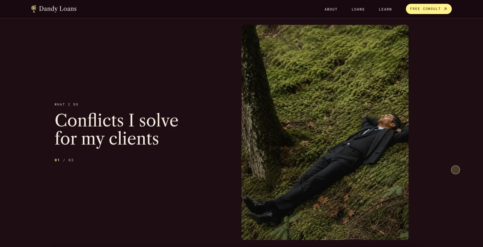
The main headings throughout the Dandy Loans website carry the essential argument. A visitor who reads only the most prominent text can still understand the nature of the business, its distinction, its process and the next available step.
Supporting copy provides depth for those who require it.
This layered structure accommodates different degrees of attention without reducing the substance of the content. The page remains accessible to the scanner while rewarding the more deliberate reader.
The principle also protects the website from a common form of communicative excess.
Many businesses equate comprehensiveness with the simultaneous display of information. Services, benefits, testimonials, buttons, statistics and icons are placed within the same visual field in an effort to appear substantial.
The result frequently diminishes comprehension.
Human attention is selective. When every element seeks prominence, the hierarchy collapses and the user must determine the order of importance independently.
The Dandy Loans interface uses scale, spacing, rhythm and placement to make those decisions explicit.
The composition identifies what should be perceived first, what supports it and where the user may proceed. This creates a more economical experience because attention is directed rather than merely solicited.
Negative space as cognitive infrastructure
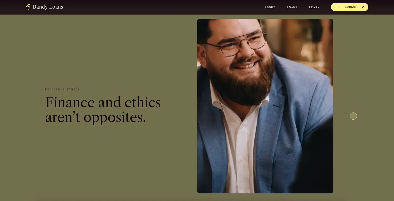
Negative space plays a functional role throughout the website. Its purpose extends beyond elegance. Space separates propositions, reduces visual rivalry and gives each section sufficient time to register. It creates intervals within which the user can assimilate one idea before encountering the next.
This function becomes particularly valuable in financial services.
The category already carries a degree of cognitive and emotional weight. Users may be considering unfamiliar terminology, competing products and consequential decisions. A crowded interface would compound this burden.
A spacious interface introduces order.
The Dandy Loans layout uses generous margins, large typographic fields and controlled transitions to produce a sense of composure. The resulting calmness serves the brand position while also improving intelligibility.
Blank space is often discussed as a matter of aesthetic taste. Its wider significance concerns perception.
Density can make a capable organisation appear less disciplined. A considered rhythm can make complexity appear more manageable. The amount of space surrounding a statement influences the importance, confidence and attention attributed to it.
Negative space is therefore part of the website’s cognitive infrastructure.
;
Editorial art direction and commercial distinction
The visual language of the website draws from editorial design rather than from the habitual grammar of financial-service websites.
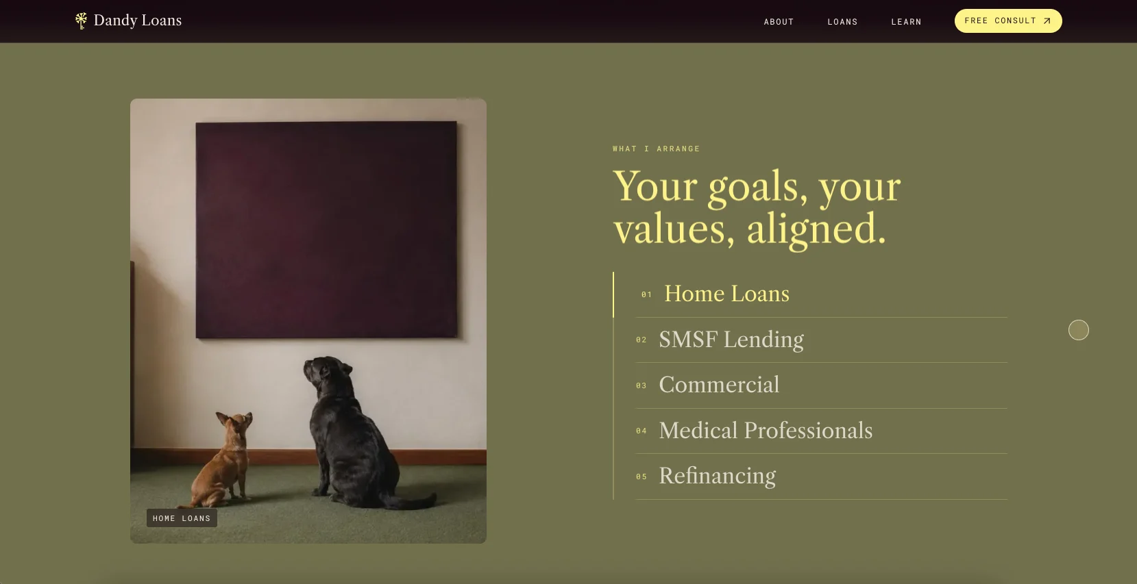
Large typography, asymmetrical compositions, cropped imagery, restrained colour fields and deliberate changes of pace create a recognisable visual cadence. Each section has an individual function while remaining part of a continuous narrative.
The site feels curated rather than assembled.
This distinction carries commercial consequences.
Templates can arrange information efficiently, but art direction determines how that information is interpreted and remembered. It establishes atmosphere, cultural position and perceived quality.
For Dandy Loans, the challenge involved creating distinction without compromising confidence.
A conventional financial identity based on blue gradients, generic service icons and stock photography would have rendered the business familiar but interchangeable. An overtly environmental visual language would have risked making it appear more activist than advisory.
The final direction occupies a considered middle ground. It conveys financial seriousness while retaining the ethical and human qualities that distinguish the business.
The design feels professional, composed and contemporary. Its individuality emerges through the coherence of the system rather than through novelty for its own sake.
This is the commercial role of art direction: to create recognition in a form appropriate to the expectations of the audience.
Typography as a form of argument
Typography contributes to the meaning of the website before a sentence is consciously interpreted.
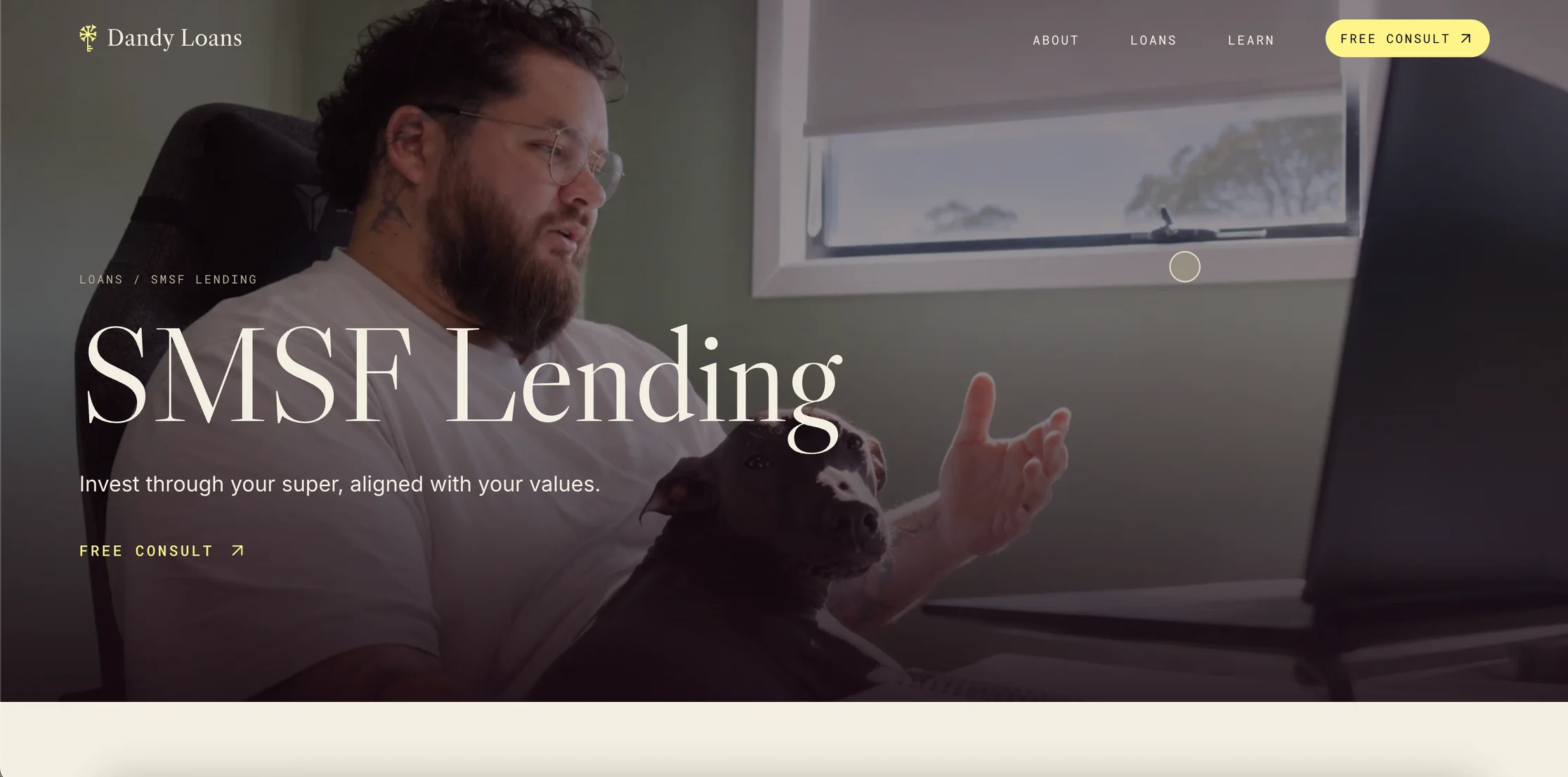
The serif typeface introduces associations with publishing, reference works, scholarship and established knowledge. It gives the brand an editorial and authoritative character.
The supporting sans-serif provides clarity across navigation, interface elements and longer passages. A mono-style typeface introduces precision, structure and a subtle technical quality.
Together, the type system mediates between authority and accessibility.
The website feels considered without becoming archaic, and refined without becoming remote.
Typography, in this context, functions as a form of argument. It communicates the intellectual disposition of the brand through shape, proportion and rhythm.
The choice of typeface cannot be separated from the desired perception of the business. A font does more than occupy space; it invokes a cultural lineage.
The same principle informed the colour palette.
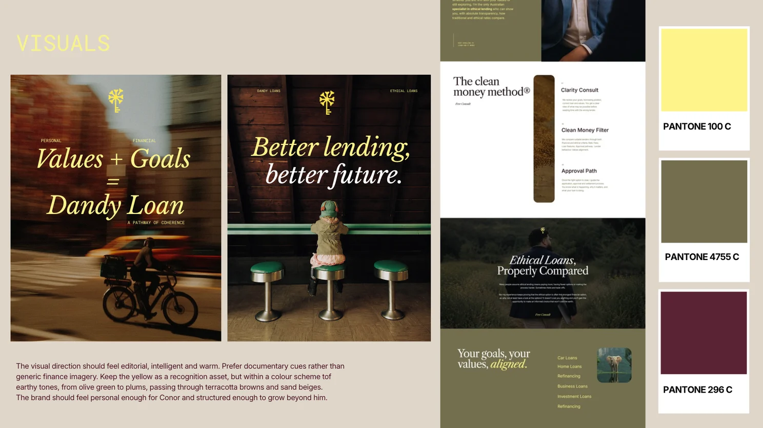
Olive tones create a restrained association with ethics and the natural world. Plum and maroon contribute depth, maturity and commercial gravity. Yellow introduces visibility and optimism while retaining continuity with the existing identity.
The saturation remains controlled because the brand required confidence rather than visual insistence.
Each colour participates in the wider rhetoric of calm authority.
Photography and symbolic restraint
The photographic direction avoids the familiar iconography of finance.
Calculators, handshakes, house keys and staged corporate encounters tend to identify a category without distinguishing the company within it. Environmental imagery can become equally formulaic when it relies upon leaves, forests or overt green symbolism.
The imagery selected for Dandy Loans creates a broader emotional world of movement, direction and thoughtful decision-making.
Its symbolism remains suggestive rather than literal.
This restraint allows the audience to project itself into the experience. The images create atmosphere and human context without competing with the explanatory role of the copy.
Strong art direction often depends upon this division of labour.
Language can define the proposition. Photography can establish its emotional register. Typography can confer authority. Layout can govern sequence. The experience becomes coherent when each element performs the function to which it is best suited.

Copywriting as interface design
The copy was developed as part of the interface rather than as material inserted after the layouts had been determined.
Its role encompassed explanation, reassurance, differentiation, search visibility and conversion.
The central challenge concerned tone.
The website needed to articulate a values-led proposition while avoiding moral pressure. A user considering a financial decision should feel guided rather than judged.
The language therefore remains calm, precise and consultative.
The service is presented as an opportunity to compare options and understand their consequences. This approach makes ethical lending intellectually and commercially accessible to people who may be interested without being committed.
The distinction has practical significance.
Pressure can provoke resistance before the value of a service has been properly considered. A comparison-led proposition creates space for curiosity. The user is permitted to investigate before deciding.
Copywriting contributes to UX whenever it reduces uncertainty, clarifies expectations or lowers the mental effort required to proceed.
The words on a button, the explanation preceding a form and the description of the first conversation all influence behaviour. Their apparent smallness should not obscure their cumulative effect.
Calls to action and the maturation of intent
The calls to action were placed according to the gradual maturation of user intent.
An early call to action serves visitors who arrive with sufficient awareness and motivation to proceed immediately. Subsequent calls appear after the service has been explained, after evidence has strengthened confidence and after common objections have been resolved.
This arrangement creates a logical relationship between content and action.
A call to action becomes more persuasive when the preceding material has supplied a reason to respond. Its placement should correspond to a moment of developed readiness rather than to an arbitrary repetition pattern.
The enquiry itself was framed as a low-risk step.
A free clarity call or comparison allows a visitor to explore the service without making an immediate commitment to a lender or a position. Microcopy such as “No cost”, “No pressure” and “No long form” reduces the practical and emotional friction attached to the decision.
These details possess considerable conversion value.
An unnecessarily long form, an ambiguous next step or uncertainty about the nature of the commitment can interrupt an otherwise favourable intention. Clear expectations preserve momentum.
The website also accommodates different preferences for contact. Some users wish to book directly, while others prefer to submit an initial enquiry. Providing both routes gives the visitor agency without creating excessive choice.
Conversion design becomes more effective when it acknowledges the plurality of user behaviour.
Objection handling as part of the architecture
The FAQ section performs a commercial function within the wider information structure.
Play
The FAQ section should perform a commercial function within the wider information structure.
Its purpose is to address concerns that may prevent an interested visitor from progressing. Questions around competitiveness, lender availability, compromise and process are resolved before they harden into reasons for departure.
This approach can improve conversion while also refining lead quality.
A prospective client who reaches the enquiry stage with fewer unresolved concerns is more prepared for a useful discussion. The website has already completed part of the explanatory work that would otherwise fall to the first consultation.
The FAQ interaction was also treated as a branded component.
Its visual behaviour and iconography belong to the same design system as the rest of the site. Functional elements should participate in the identity rather than appearing as generic insertions.
Consistency at this level strengthens the impression of care and technical completeness.
Making invisible expertise visible
The Clean Money Method® gives structure to the service itself.
Professional service businesses often encounter difficulty when communicating value because much of their expertise resides in judgement, experience and process. These qualities remain largely invisible before engagement.
A named methodology makes that expertise more legible.
It clarifies how the service proceeds, creates a memorable intellectual asset and distinguishes the business from competitors whose offering may appear superficially similar.
The framework also provides a foundation for future communication. It can organise educational content, client explanations and marketing campaigns around a stable idea.
Branding produces commercial value when it gives form to something the business already does well but has not yet made perceptible.
Performance as a design constraint
The website achieved its 100 Performance score while retaining large editorial typography, image-led sections, responsive compositions and custom interactive details.
This outcome depended upon treating performance as a design constraint from the beginning.
Every script, animation, image and visual effect carries a technical cost. The inclusion of an element should therefore depend upon the value it contributes to the experience.
Development restraint is an aesthetic and commercial discipline.
Images were considered according to their role, dimensions and loading context. Interactive elements were evaluated according to their usefulness. Responsive behaviour was planned as part of the system rather than repaired after the desktop design had been completed.
The resulting site feels visually rich without becoming technically burdensome.
Performance seldom emerges accidentally. It requires priorities, limits and continuous attention across design and development.
The Lighthouse score provides evidence of this discipline, although the commercial effect appears in the experience itself.
A fast website feels immediate, controlled and reliable. Delay introduces friction before the business has had the opportunity to communicate its value.
Performance and commercial efficiency
Website speed acquires further importance when the business invests in advertising.
Every paid visit represents an acquisition cost. A slow or unstable landing experience erodes the value of that investment by increasing the likelihood that attention will be lost before the proposition is understood.
A fast website gives marketing a stronger destination.
The combination of immediate loading, clear positioning, visible evidence, concise forms and deliberate calls to action improves the conditions under which acquired traffic can become enquiry.
The website therefore operates as part of the client-acquisition system.
Branding, UX and development converge at this point. The visual identity attracts recognition, the information architecture sustains attention, the copy creates understanding, and the technical build preserves momentum.
Commercial performance depends upon this continuity.

Responsive design as adaptation
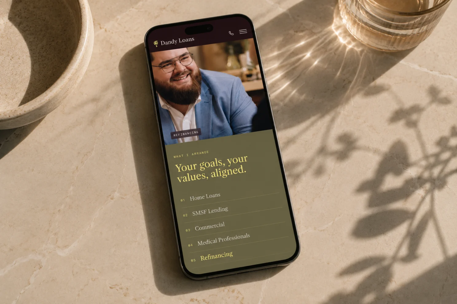
The desktop experience uses generous spacing, large type and editorial composition. Smaller screens require a different treatment of sequence, scale and attention.
The mobile version was designed as an adaptation of the same system.
Columns stack according to a logical reading order. Typography retains its hierarchy without overwhelming the available space. Images continue to support the narrative, and calls to action remain accessible throughout the journey.
The identity remains recognisable because its principles survive the change of format.
Responsive design should preserve meaning rather than reproduce geometry. The web is an adaptable medium, and the strength of a design system lies in its capacity to maintain coherence under changing conditions.
A mobile layout succeeds when it interprets the desktop experience rather than merely compressing it.
Search, semantics and contemporary discoverability
SEO and GEO principles were integrated into the architecture through page hierarchy, semantic clarity, service terminology and explanatory content.
The website needed to communicate effectively with human readers, search engines and AI-mediated discovery systems.
This required precision rather than repetition.
Clear headings, well-defined page intent and coherent service language make the subject of the website easier to identify. They also improve the user’s ability to understand where they are and what each page contains.
Optimisation functions best when it clarifies the subject instead of distorting the prose.
The editorial voice remains intact because search considerations support the architecture rather than governing every sentence.
This balance becomes increasingly important as digital discovery extends beyond conventional search results.
Accessibility as an index of care
The Accessibility score of 91 reflects attention to typography, spacing, logical order, interaction areas and navigational clarity.
Accessibility contributes to the quality of the experience for a wider range of users. It also reveals the degree of consideration embedded within the design process.
A visually sophisticated website reaches its full value when its hierarchy remains legible, its interactions remain usable and its content remains comprehensible across different contexts.
Accessibility therefore belongs to the same system as performance and art direction.
Each concerns the relationship between the formal qualities of the website and the conditions under which people encounter it.
The result as an integrated system
The completed Dandy Loans website gives the business a clearer market position, stronger authority, greater visual distinction and a more deliberate path towards enquiry. It also provides a fast, responsive and search-ready platform for future growth.
The project illustrates the approach I apply through Adcraft Studio.
I begin with the commercial problem and the audience’s perception of the business. Positioning establishes the proposition.
Information architecture determines the sequence of comprehension. Copy guides interpretation. Art direction creates recognition. UX removes friction. Calls to action translate confidence into movement. Development protects the immediacy and stability of the experience.
The Lighthouse results make the technical quality visible.
The broader achievement lies in the concordance of the parts.
A high-performing website aligns strategy, language, design and development around a common commercial purpose. It helps the audience understand the business more rapidly, perceive its value more clearly and approach enquiry with greater confidence.
Performance, in this sense, represents more than speed.
It is the capacity of the entire website to fulfil its function with clarity, distinction and economy.
That is the standard I aim to establish in every website project.
At Adcraft Studio, we design websites for companies and organisations where credibility is part of the buying decision.
Our work begins with the commercial problem, the audience’s perception and the standard the business needs to project. From there, we build websites that are distinctive, fast, persuasive and technically sound.
We also believe that considered web design should not be reserved only for large corporations with excessive budgets. Our prices remain accessible because part of our mission is to help raise the standard of Australian websites: to make them clearer, faster, more memorable and more commercially useful.
For businesses considering a new website, we offer The One-Week Website Proposal Sprint.
Book a consultation with us, and within seven days you will receive a website proposal including sitemap, structure recommendations, scope and pricing.
You will see how we think before you commit to working with us. The proposal is yours to keep either way.