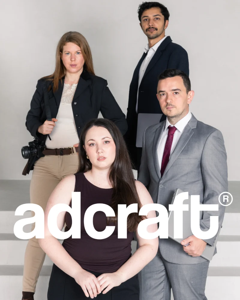
The brief was clear: Absolute Coastal Care wanted a brand with its own visual language, unique, distinctive and unforgettable, to not be confounded with any other NDIS organisation, to not have the same same NDIS cliches, but to be feminine, creative, curated, warm and evocative.
Also, they wanted a website that was accessible and easy to use, but also that was a perfect extension of the branding - emanating the same sense of warmth and native-earthy vibe. A website that could inspire trust and convey the essence of the organisation at a gut-feeling level.
The NDIS sector has developed a familiar design vocabulary. Bright primary colours, rounded icons, stock photography and very literal images of care appear everywhere. For Absolute Coastal Care, we took a more editorial and considered direction. The identity needed warmth, though it also needed maturity, character and enough visual depth to remain recognisable.
Our work at Adcraft covered the full experience: brand strategy, logo design, colour, typography, illustration, photography direction, print material and website design. Each part had to support the same expectation. This would be a service where people, communication and presentation were handled with attention.
Care had to be visible before a conversation even began.
Branding is about setting the right expectation
Brand design results in cues that give people a sense of what to expect. That's why a company should be careful about the way its touchpoints are designed.
For instance, a cluttered website can suggest a complicated process. An interchangeable logo can make a service feel interchangeable.
A carefully composed identity creates a different impression: someone has taken the time to think about how information is presented, how people move through it and how the smallest details fit together.
That was the expectation we wanted to establish through the visuals.
The brand needed to feel calm, personal and well organised. There is space around the words and images. The colours are grounded. The typography brings a quiet sense of confidence. Botanical illustrations of native flowers add expression without overwhelming the information, and connect with a sense of belonging.
This balance became important across the project. Participants, families and support coordinators need clarity. They also deserve a visual experience with personality and dignity.
The result treats the audience as adults. It feels warm and human, with a strong editorial eye.
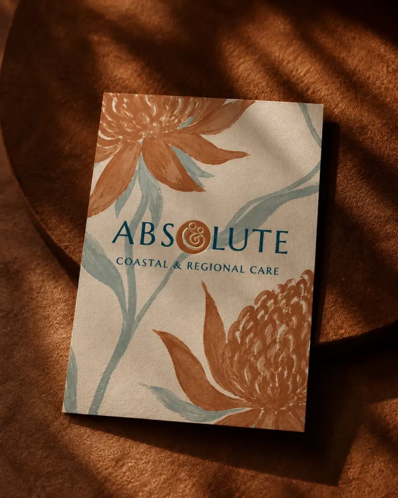
The meaning inside the mark
The central symbol of the logo brings two human figures together within a rounded shell- form. It suggests a relationship between a participant and support person, an embrace, or two people moving through an experience together.
At the centre is a spiral.
The spiral carries several meanings: continuity, growth, movement and the gradual development of trust. Progress rarely follows a perfectly straight route. People revisit places, learn through repetition, build confidence and move forward at their own pace. The mark captures that idea in a simple form.
Its circular shape also creates a feeling of closeness and protection. The figures remain connected while retaining their individual forms. That relationship became a useful visual summary of the service: support built around the person.
We developed the symbol to work within the full logo and as an independent mark. It can appear on uniforms, social media profiles, documents and small printed applications while remaining immediately recognisable. The logo suite also includes stacked and horizontal variations, giving the identity enough flexibility for different spaces.
Why the wild flowers became central
The native plants gave the identity much of its character.
They are all strong, sculptural Australian flowers with a complex structure. Many smaller elements gather around a defined centre, creating something intricate and resilient. That made it a fitting symbol for personal growth, individuality and the network of relationships that can surround one person.
The flower also brings a strong connection to the Australian landscape. Combined with leaves, seeds and soft coastal forms, it gives the brand a sense of place. The identity belongs to the coast and regional communities.
We drew the proteas with enough detail to feel organic and tactile. They appear as complete flowers in some applications and as cropped elements in others, entering the page from its edges. This creates movement and makes the layouts feel curated, almost like pages from an independent magazine or a carefully produced publication.
The illustrations also give the brand freedom. They can take a leading role on a business card or social graphic, then sit quietly in the margin of a document where the information needs more room.
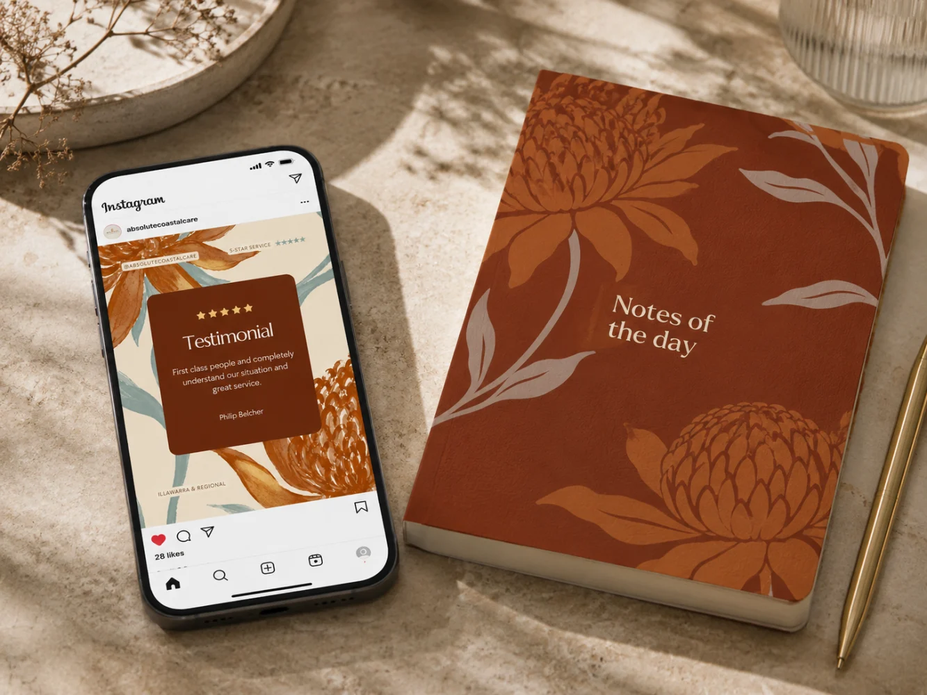
Colour with meaning and expression.
Often we are asked about colour psychology: it's a very misunderstood subject indeed - as if it was a linear matter of red equal urgency and blue equal trust. In reality colours are complex and nuanced. A red can be certainly awakening and allarming if in a saturated form (traffic light red for instance) but it can also be welcoming in the form of a velvet crismon (think theatre curtains and chairs) or earthy and evocative in the form of a rusty reddish-brown shade like for the above brand.
In practice, it's not the nominal colour itself, but its nuance and context to give meaning and feelings.
Meaning comes from the shade, its saturation and brightness, the contrast around it, the material it appears on and the broader palette it belongs to. A muted colour paired with warm neutrals tends to create a quieter atmosphere. A brighter shade placed against a contrasting background carries more energy. Texture changes the effect again: rust printed on uncoated paper feels different from the same colour glowing on a screen.
For Absolute Coastal Care, we drew the palette from coastal landscapes, native plants and Australian earth. It gives the identity a sense of place while setting the emotional tone for the wider brand.
Deep navy provides structure. It has enough visual weight to anchor the logo, headings and important information, creating a sense of clarity and composure across the website and printed material.
Rust and burnt orange come from the protea, coastal rock and dry soil. Their warmth makes the brand feel more personal, while the earthy undertones keep the result mature and grounded. These colours also give ACC a recognisable presence within a sector where cooler blues, purples and bright multicolour palettes appear frequently.
Sage and muted blue-green introduce a softer rhythm. They recall foliage, open water and the hazy colours of the coast. Used across backgrounds and supporting elements, they create visual pauses and help longer pages feel easier to move through.
Warm cream became the main neutral. Compared with a stark digital white, it feels softer and more tactile. It gives the website a comfortable reading surface and carries beautifully into print, where it helps the identity feel curated and considered.
Together, the colours create an atmosphere of warmth, calm and quiet confidence. The range is broad enough to support service information, forms, calls to action, signage, uniforms and longer documents, while every application still feels part of the same world.
Typography that carries character
Typography played a large role in moving the brand beyond the usual visual language of the sector.
The main serif typeface has tall, narrow forms and a strong editorial quality. It gives headings presence without making them feel loud. The supporting typeface is cleaner and more direct, making service descriptions and practical information easy to read.
Within the wordmark, generous letter spacing creates calm and composure. The letters have room to sit confidently, while the stacked structure gives the name a clear rhythm.
This combination allows the brand to move between expressive and functional applications. A headline can feel distinctive. A service page can remain straightforward. A formal document can look organised and professional without losing the identity behind it.
The logo system was designed to remain clear across signage, uniforms, documents and digital formats.
Photography with a sense of real life
The photographic direction combines portraits, outdoor environments and more abstract images of movement, texture and light.
Candid portraits help the brand feel personal. Landscape images introduce place and atmosphere. Softer, blurred details create pauses between more practical pieces of information.
We chose imagery that feels observed rather than staged. Natural expressions, real environments and imperfect moments give the visual language more life. They also sit comfortably beside the botanical illustrations, creating a mix of human presence and landscape.
The presentation brings these images together as a varied editorial sequence, combining portraits, horses, native flora, water and motion.
Play
Website Design by Sofia Cavalli (Adcraft)
A website people can actually use
The website had two jobs.
It needed to leave a mark, and it needed to help people find information quickly.
We carried the visual identity into the digital experience through generous spacing, strong typography, native illustrations and carefully placed colour. Each page has a clear composition, though the design always supports the content.
The information hierarchy guides visitors through the site in a natural order. Service headings are easy to scan. Text is broken into manageable sections. Contact pathways are visible. Navigation remains straightforward across desktop, tablet and mobile.
Accessibility was considered through readable type sizes, clear contrast, spacing between interactive elements and a predictable page structure. These choices reduce visual effort and make the site easier to navigate for a wider range of users.
A memorable website does not need to become complicated. Strong art direction can sit beside familiar controls, clean menus and direct language. That is where the site finds its balance.
Responsive design and speed
The website was designed to adapt across different screen sizes, with layouts restructured for mobile rather than simply compressed.
On a smaller screen, the order of information matters. Headings need enough room. Buttons need to be easy to select. Images need to support the page without pushing important content too far down. We considered these details throughout the responsive build.
Performance was also part of the production process. Large images and decorative graphics were prepared for web use, helping pages load efficiently while keeping the visual quality of the brand. The page structure was kept clear and controlled, allowing content to appear cleanly without unnecessary visual weight.
Fast loading supports usability, especially for visitors using mobile data or slower regional connections. It also creates a better first impression. The site feels ready when someone arrives.
SEO built into the website structure
Search visibility starts with the way a website is organised.
We created a clear page hierarchy around the services and information people are likely to search for. Headings give each page a defined subject. Page titles, descriptions, image information and readable URLs help search engines understand the content.
Responsive development also supports mobile search, while efficient page loading contributes to the overall technical health of the site.
SEO and design were treated as part of the same job. A search engine needs to understand the page. A person needs to understand it even faster.
The website gives Absolute Coastal Care a sound base for future service pages, local search content and ongoing optimisation. It can grow without requiring the visual or structural system to be rebuilt each time.
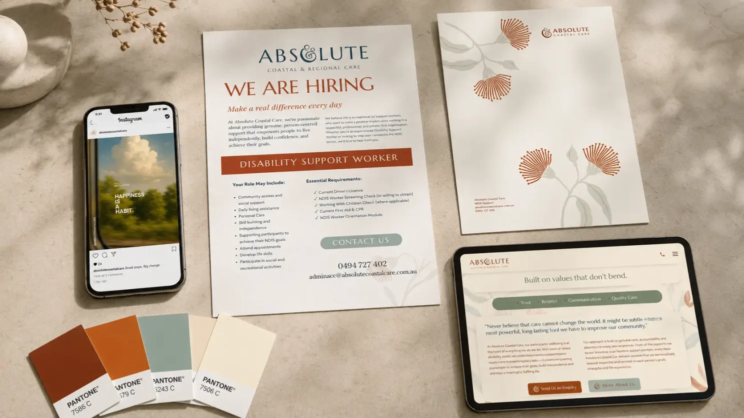
Extending the identity across every touchpoint
A company starts to feel established when its identity holds together everywhere people encounter it.
The website may be the first point of contact, though it is rarely the only one. Business cards, flyers, letterheads, email signatures, social media graphics, uniforms, forms and printed documents all contribute to the same impression. When these materials look coherent and intentional, the organisation feels prepared, reliable and fully formed.
For ACC, we developed the identity well beyond the screen. We designed business cards, stationery, email signatures, clothing, social assets and supporting printed pieces, carrying the flower illustrations, logo variations, typography and colour palette across each application.
Print matters because it enters real conversations. A flyer may be picked up at an event. A document may be handed to a participant, shared with a family member or used during a meeting with a support coordinator. Each piece becomes part of the experience of the service.
We used warm paper tones, generous margins, clear typography and restrained botanical details to give these materials a curated quality. The information remains easy to follow, while the presentation feels deliberate and complete.
That sense of curation was central to the work.
The word curation comes from the Latin curare: to care for, attend to, look after. In design, it means selecting what belongs, giving each element its place and maintaining consistency across the whole system.
The same principle applies to service. Attention is communicated through preparation, continuity and the handling of small details. A clear website, a well-designed form, a carefully printed flyer and a coherent email signature all send the same message: care has already been taken here.
The finished work
Adcraft created a complete brand and website system with a strong sense of place, a recognisable visual character and a clear understanding of how people use information.
Every part contributes to the same impression: care has been taken here.
Need a visual identity, a clear brand strategy, a website with presence or advertising that works?
Adcraft is the award-winning boutique firm you’ll want to partner with.
We bring strategy, design and performance together, so every touchpoint feels intentional and supports the same commercial direction.